Another false claim about CDC data goes viral
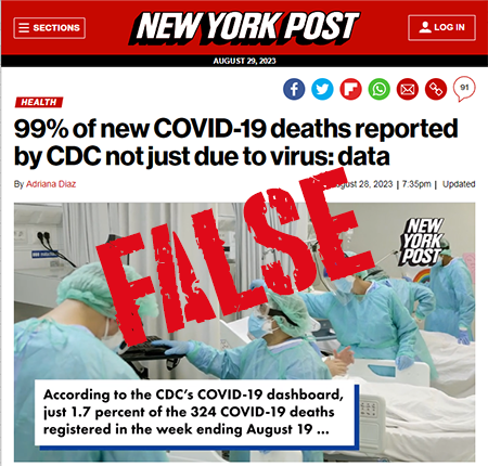
DailyMail and New York Post articles misinterpret CDC data about Covid death percentages
About two weeks ago, I had to take a break from Twitter and Substack to attend to an urgent family matter, and I just returned yesterday (Monday, Aug. 28).
Just before I took my Twitter break, I debunked a viral graph that incorrectly showed pediatric Covid hospitalizations in the NYC metro area were skyrocketing. For that, I was maligned as a Covid minimizer and even a child murderer by the CovidZero crowd. I’ve gotten used to such vile attacks from that side.
Then yesterday, my first day back posting on Twitter, a friend directed me to a tweet linking to an article in DailyMail that claimed that less than 2% of Covid deaths in recent weeks had Covid listed as the underlying cause. The article was a gross misunderstanding of the CDC graph referenced. The footnotes of the CDC graph make it clear that the percentage shown is the percentage deaths attributed to Covid out of “the number of deaths from all causes” (emphasis mine). When I pointed this error out, I was accused by those on the right of trying to prolong the Covid fear, for being a pharma shill, for virtue signaling….
Data illiteracy and tribal allegiance are major problems in Covid discourse. While I often call out the CDC, the mainstream media, and various scientists and others for exaggerating Covid risks, I also don’t hesitate to point out when demonstrably false information is spread that goes the other way. I’m on the side of truth and accuracy. It does not help people arguing for real investigation into our Covid data and our Covid response to promote completely bogus stories like this latest one.

These articles were spread all over Twitter yesterday by journalists, politicians, and many others. But the articles and tweets got the data completely wrong. The CDC data simply does not show what the articles claim. The data in the CDC graph was completely misunderstood. This is partly the fault of the CDC, who has proven over and over again that they are not skilled at communicating data to the masses. But it’s also the fault of reporters and others who don’t take the time to ensure they understand the data that they are reporting. The footer on that page clearly states: “The percentage of all reported deaths that are attributed as COVID-19 is calculated as the number of COVID-19 deaths divided by the number of deaths from all causes x 100.” It’s not the percentage of Covid deaths, but the percentage of ALL deaths.
CDC also provides data to calculate the percentage of “Covid-associated” deaths each week that have Covid listed as the underlying cause of death, and the numbers are much higher than 2%. Prior to March 2022, that percentage was 90%, and from March 2022 on, that percentage is 66%. The CDC issued a report about this in November 2022 (very similar to a Twitter thread I did on the same topic in September 2022). The numbers from March 2022 and later haven’t fluctuated much, and are still at 66%, just as they were a year ago. From this CDC data set, I graphed the percentage of Covid deaths where Covid is listed as the underlying cause below, so you can see this trend.
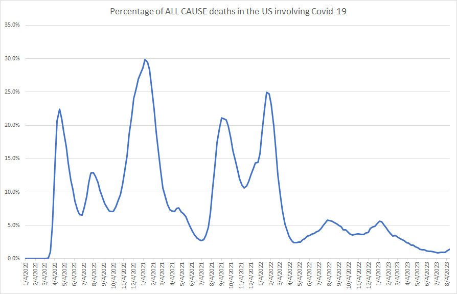
I also used the same CDC data source to recreate the graph shown on the CDC dashboard that is referenced in the DailyMail and NY Post articles. This shows the percentage of ALL deaths that “involve” Covid-19. Note: Deaths “involving Covid-19”, also known as “Covid-associated deaths” are deaths where Covid is listed as an underlying cause or a contributing factor on the death certificate.
This doesn’t mean that the CDC data is perfectly accurate. It’s quite possible that the CDC data overstates how many deaths are caused by Covid-19, either as an underlying or a contributing cause. I happen to agree with that. But it’s still entirely false to claim that the CDC is reporting less than 2% of Covid deaths are actually caused by Covid. Next time you see an extreme claim like that, especially if it happens to fit your biases, it’s best to do a sanity check before amplifying it.
The Importance of Sanity Checks
It’s been a little while since my last post. Between a winter vacation and a project I’ve been working on (I hope to share more on this soon!), I’ve gotten a bit behind. Plus, it seems like every time I have something I want to write about, another new thing comes along before I get a chance to sit down and actually write it up. But there’s been a commo…
I hope this puts this issue to rest. I have contacted the authors of the DailyMail article and the NY Post articles, as well as the DailyMail corrections department and the NY Post online editor. Hopefully these articles will be retracted or significantly rewritten soon.
UPDATE: DailyMail contacted me and has updated their article to reflect the accurate data. New York Post has also updated their article (though it’s still not quite right, and they did not add a correction notice or update the content in the video included with the story).


Thanks for being willing to tell us the truth, regardless of who gets angry with you. We just need accurate information.
This is an example of basic innumeracy. Anyone with a modest grasp of statistics, who's paid the slightest attention to covid mortality stats this decade, can recognize immediately that 99% is way too high.